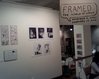
Comics are a focus here however there are other very big displays in the open areas. The displays really don’t connect with the comics at all and seems somewhat very random. The atmosphere is welcoming yet congested; there are few less seats for students, which is bothersome and harder to get a seat. Everything in display makes it look like there is so much going on.
Angeline mascarenas "A day in the life of a snowman" pen and ink on board, 2009 This cute little snowman comic is somewhat very amusing, its simple though tells you a story that makes you ask a lot of questions, who throw the snow at him, why did he make a snowgirl and ripped out her heart. The comic is plain, nothing in the background, which was a good choice since there is not needed to be anything more. The artist didn't put any words, just pictures to let the readers mind only guess. The color is plain as well; nothing bright, mostly cool light purple, grey colors to match the snow and sky. Usually simple is the best kind of message for a viewer. Gets them to look when walking by and makes them want to stop and notice what is going on in the image.
Joyce Rice "My last winter in grawn, MI" Digital Print 2009. Her comic was on one side and on the other they picked her biggest panel from her comic and enlarged it redoing it, painting on the wall itself. The art style is very interesting and sticks out a lot compared to some; it’s her own style. Colored in only blue tones and one light brown color it looks well made and completes the image, she not even needed to put any other colors looks well. The text is easy to read and clear, cell shading, a clean piece of work. The story is compelling to make you want to view the full comic page to start from the beginning to find out what’s going on.
Stephanie wegryzn and john coxworth hellgeezer' digital print 2009 has only text on this piece is the title in English and Japanese, looks heavily shaded, tones, black and white, the mood feels serious and some sort of mystery to it. Blood in each individual panel. Detailed smoke making it confusing to the characters, black to white fading setting a mood, lighting very important hitting the characters and objects. The comic pages makes you wish there was more, or turned into a comic or a manga book.
This gallery really is a comic book artists’ treat. Seeing such variety of work from the student body, it’s really an eye opener to view and understand the talent others show and their knowledge of the style of comic books. The different styles, techniques, rendering one can do when making a comic, the feelings and ways that get the reader to get a much better understanding of what the artist is trying to bring forth in their work.
Location: 623 S Wabash Ave, first floor. Gallery Hours: Monday through Thursday, 9am–7 pm, Friday, 9 am–5 pm
Phone: 312.369.8177

My favorite part about this review is the great descriptions of your favorite pieces. As I have not yet been to the show it is nice to be able to "picture" some of the pieces before I go.
ReplyDeleteI think one thing that needs work is the intro. I felt like I was thrown into the review with no set-up so for the first few paragraphs I literally felt disoriented. Also, what you have as an intro paragraph seems a little all over the place. If this paragraph was cleaned up a little, with a few more sentences added as a intro to the space, then I feel like this could be a strong review.
I second Kevin's take on both counts. You drop us rather abruptly into the scene of the action without suggesting what your overall point is here, or what the larger setting is like. The tell-tale sign is that "here" in the first sentence--we readers don't know where "here" is yet, so in the first sentence we already feel like we missed something. The lack of transitions between paragraphs intensifies that feeling of jumping from item to item--you need greater effort at making the review cohere--that's what intros and transitions do, give you a chance to underscore your larger point, and build relationships among the individual works so you can comment on the show as a whole.
ReplyDeleteBut, like I said, I also agree with Kevin that your information-gathering and your descriptions are very thorough and informative. This really adds to your credibility because it speaks to the fact that you were there and you were paying careful attention. If you can combine those observational skills with a clearer overall purpose and structure, you'll be doing excellent work.