I believe reviewing the arts is very important. Art is everywhere and is a big part of life. Being able to understand what other people see in art and interpreting it through their eyes is very useful. It opens a door to different ideas and helps to broaden your mind. Before I knew how to review the arts, I had no idea what components were needed to do so. Thinking differently when visiting a site, giving detailed analysis, writing clearly and grabbing the reader to make them interested. When I started, I didn't know how to structure my reviews. Now at the end, the presentation is better and I feel I've learned the basics of how to write art reviews. Reviewing the arts has really improved my overall ability as a writer and as a thinker. It has helped in making me come to focus how I see the meaning of it. Columbia College was such a great community to do such reviews and brought me even closer to the campus, students and teachers. Taking the opportunity to review Columbia's art students as not only helped my reviewing but my writing overall.
Wednesday, May 12, 2010
Columbia College Review Final
Monday, April 26, 2010
Access Excess


Wednesday, April 21, 2010
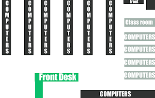
9th Floor Computer Lab

The 9th floor computer lab is one of the most complex floors filled with many things that catch the eye compared to most of the floors inside this building. Opening the door from the s
tairs or coming off the elevator the room you can tell right off that the room is pretty much full of life. There are current students working at the front desk, very lovely people that will be very kind and will help you if you have any questions. You can ask them anything from needing help on a computer program glitch, needing supplies you didn't have time to bring with you to class and even if you need to find a class room.
There are plenty of computers in this huge room where each one you can choose whether you want to use windows or Mac desktop, all the pro
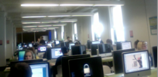
grams you need for your classes are there and ready for you to start working. There are always many students diligently working on their homework.
The computers are in the center of the floor while it is surrounded by two classrooms that share the same floor, no wall separating it. Going through one of the class rooms you get to the cut paper section where students are free to use the free space to cut paper, measure, trace on the light box and work on anything they need to do. Taking care of all the equipment, using it correctly, sharing with other students, making it a fun filled experience.
The environment is very lively and friendly, not once I’ve seen any kind of fighting break out, everyone is respectful for one another and helps each other with giving advice on ones artwork.Once you get used to how everything works you do tend to notice certain cliques with groups of friends like the Illustrators, Graphic Designers and Animation artists, but that’s not to say that’s a bad thing, everyone gets along, you just also notice people get to meet others in the same major early on and connect with them over time having to take many classes with them. They form a very strong bond and they all help one another if one needs assistance. Of course there is a sense of competition but it’s rather a friendly one. Everyone wants to see one another do well.
Sunday, April 18, 2010
Harrison Red Line Stop

Wednesday, April 7, 2010
Spongebob Square Pants

Now I'm a hardcore cartoon-obsessed artist. Back in the 90's, as a kid, watching Nickolodeon was like an addictive drug, and I'm sure you can relate.This kid channel aired great cartoon shows such as Rugrats, Doug, Rocko's Modern Life, The Ren and Stimpy Show, AHH Real Monsters etc. The list goes on with memorable shows and I wish I could elaborate more to make you think down memory lane, but this blog as you know isn't for that. There is just one nicktoon that really gets under my skin and its none other than that yellow loud mouth fruitcake Spongebob Square pants. I can't believe how low cartoons have gotten and this cartoon is one of the few that I just cannot sit down and watch for the life of me.
The theme song is just horrifying, you got some irritating pirate man and a bunch of annoying kids screaming spongebob square pants a total of 8 times. Other than that it explains that he lives in a pineapple under the sea. More descriptive it’s called Bikini Bottom at the floor of the Pacific Ocean. Spongebob (Tom Kenny) works as a fry cook at the Krusty Krab restaurant, which how is that even possible if they are living under water, but hey it’s only a cartoon show. He’s best friend is a sea star named Patrick (Bill Fagerbakke), another so called friend is a octopus name Squidward (Rodger Bumpass) who isn’t too pleased to be around the two. They all seem to get into some random obscure adventure each episode. Somehow people just love to watch them interact and enjoy. This series was the top of Nickelodeon’s ratings chart and maintained a huge fan base. It’s full of wacky humor, silly scenes that appeal not only children but many adults as well. Many say that it sends positive messages about friendship, hard work and loyalty.
There are so many people who just adore this show so much. Having all kinds of merchandise and what not. They are obsessed and I just can’t put my finger on how and why. I was forced to watch the Spongebob Movie when it hit theaters with my younger sister and cousin and it just didn’t make any sense. The jokes were random; I don’t see how little kids really get what’s even going on. Supposedly now there are a lot of dirty jokes my 15-year-old sister told me in the cartoon series. I watch my sister as she still watches the show constantly, bawling out laughing while I stare in confusing. You would think I could understand the humor behind it all since I still watch cartoons but Spongebob just isn't for me. The annoyance level on this show for me is high and I stay away from it at all costs.
I assume that I have to try and be in the shoes of the other people because I know for a fact the cartoon and anime shows I fully love and enjoy, people also hate a great deal. Everyone has their own likes and hobbies and I think people really shouldn't bash others for liking something like Spongebob. I always thought that was the best way, don't argue or fight, just let them be happy with what they enjoy. Your life will be much better with just staying happy.
Wednesday, March 31, 2010
Justified

“Justified” what seems to be a police drama starts its show rather climatic, as one of the two characters knew they were going to die right there at that table outside the hotel lounge. The winner is the main character, the brave ethical cowboy Deputy U.S. Marshal Raylan Givens, the new hero that really is too confident pretty quickly in this first look at him. He always seems to know how to handle each situation, can get out of trouble so easily and makes it a little game. I didn’t know if he was a decent pick for the role as I have not seen him in any other movies but from the earlier discussion the actor might of went down hill for a show like this but I won’t judge.
The group of villains Raylan must face is a group of neo-Nazis who don’t seem to as smart as you would think. I don’t know why people would really get too offended that this takes place in Kentucky for the genre, your from the South, you automatically will be targeted on a show like this. Why really waste your time on just a TV show? I’m sure this show, from what the first episode has shown wont get too many rating and really everyone just needs to relax. It’s made for the entertainment aspect. There are the heroes and the villains anywhere you go, whatever the location may be. Yes we all may not like what we see, but this is something we have to live with and deal with. I think I might give this show another shot even though I’m not of this type of genre. “Justified” shoots on the TV network every Tuesday on 10:00pm.
Tuesday, March 30, 2010
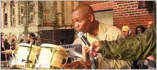
Dave Chapelle's Block Party

Wednesday, March 10, 2010
Dragonball Evolution

Dragonball Evolution is a 2009 American live-action film adaptation based upon the Japanese Dragonball media franchise, directed by James Wong, produced by Stephen Chow and distributed by 20th Century Fox. The story centers around the adventures of the lead character, Goku, (Justin Chatwin) who on his 18th birthday, is asked to gather the seven Dragonballs in order to save the world from the evil alien Piccolo (James Marsters). On his journey, he meets several other characters that aid him in his quest. From the release of the very first trailer, all indications were that the movie was going to be horrible, and despite a decent basic premise, it is. From the murky art direction to the jumbled mess of a script, poor acting and hopeless directing, this movie is a beyond terrible.
One of the most striking aspects of the movie is how inappropiately casted most of the characters are. Goku is the most notable example. You do not expect the transition from a cartoon to a live-action movie to be without major changes, but the Goku in Dragonball Evolution shares nothing in common with his anime counterpart. In the cartoon, he is a young, happy, energetic boy who rides across the land on his magical cloud, full of self-belief and spirit. Justin Chatwin's Goku is a miserable emo who rides a bike to school and gets picked on by the 'cooler' kids. Other characters are similarly miscasted, Marster's Piccolo is perhaps being the closest to resemble the character from the cartoon, but seeing as how he gets roughly 10 minutes of screen time in the whole movie, you're never given the chance to appreciate any aspect of his performance.
The down right god awful acting. The movie features some of the poorest performances I've ever seen. Chatwin chops through the clunky badly written script, in a performance so wooden it would embarrass most items of furniture. Emmy Rossum (Bulma), Jamie Chung (Chi Chi) and Eriko Tamura (Mai) establish little if any personality for their respective characters, and Joon Park's Yamcha is a disaster. Even the talented Chow Yun Fat fails to restore any credibility to it, he just smiles as he walks away with his fat paycheck.
I personally see few if any redeemable features to this movie, but I can understand why some might enjoy it, particularly a younger audience. At 90-minutes, the pain is short, and one can't accuse the movie of dragging, there's always *something* happening, regardless of whether it's good quality entertainment or not. Some may see it in the special effects, I personally think, like the rest of the movie they're awful, but the sheer brightness and flashiness may be enough to wow some viewers ( known as 12 year olds). The fight scenes as well, while undeniably cheesy are not terribly executed, just a little cliché.
In the end of it all, this movie basically is for no one, I really don't understand how someone can like this, it honestly doesn't appeal to anyone. This movie was made for nothing but the money. The people who will go and watch this movie and have no knowledge of the Dragon Ball story will be so confused by what there watching, they will most likely tell everyone it is one of the worst movies.
Tuesday, March 2, 2010
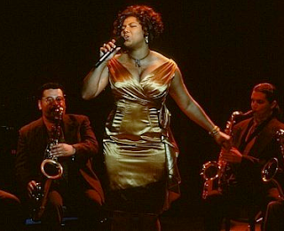
Living Out Loud


Tuesday, February 23, 2010
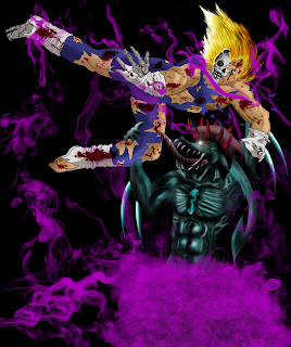
A Dragon ball World
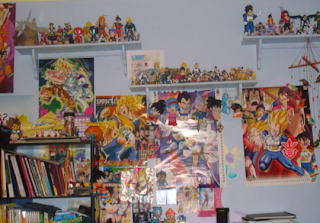
There is one massive art form that has been apart of my personal life as an artist and also a fan. It surrounds my personal guilty pleasure but also links to my way of how I see art the way I enjoy it. My personal appreciation comes from a manga series created in 1984 named Dragon ball created by Akira Toriyama. Finding out about the franchise at the age of 10 I first became a fan of the anime series and watched it religiously after school on the cartoon network channel. So obsessed I had to buy empty tapes and record all the episodes every day as well until it came out on VHS.
Some few years passed and the series finally was released on DVD. Searching online to find out more episodes that weren't released in America I browsed and became more involved on the art style. I used reference from the manga books and copied the style over and over, wanting to be able to learn how to draw the character's from memory. I become heavily interested in comic books and manga was highly being noticeable in America more through the years. I started collecting the entire Dragon ball Z manga series.

I remember spending hours on end drawing the characters that I tend to love and grow up with over the years. The back stories, character development, theme, everything that this series had, this world was the one I wanted to be in when I wanted to get away from the real world around me. In the situations the series had, it made me really think about life and also helped me relate when I had my own problems I had during my childhood with friends and family. If something happened I knew I would always turn to this series and expressed myself by drawing out my frustration making the characters in a situation I was just in.
To many people I’ve talked to, they say this is just another typical fighting ‘cartoon’, however I see it as something much more deep. Currently I am now a fan of this series for 12 years and still to this day I go back to that art style, admiration and understanding that only a hand full of people get. I had the opportunity to talked to other artists online all over the world and some I had the pleasure of meeting, sharing the same similarities and gratitude. I couldn’t stand here and tell you if Dragon Ball Z weren’t in my life I would be still drawing and wanting to be an Illustrator.
Wednesday, February 17, 2010
Shoes

Your foot includes more bones than any other section of your body. You rely on your feet every day, shoes at first were created to protect your feet from rocks, burning sands, natural hazards of the weather/climate, the rough ground that we walk and anything that would danger them. Only until recent years, the shoe wasn’t even worn by most of the world’s population. There of course still to this day where people walk barefoot who can’t afford any. Shoe prices can be one extreme to the next. Flip flops at Kmart can go for only $1.00 while at the Nike’s basketball shoes can go as high as $150.00.
Shoes are an item of decoration to the middle and upper class, they seem to be more focused on how the shoe looks rather than if it’s comfortable. Woman complaining constantly how at the end of the night they get blisters all over their aching feet. Some sort of silly fashion statement, or you can tell how a person is by the type of shoes they ware. Some people just buy shoes to match with other groups, to be with the in, not caring about price. Some want to be noticed on what their wearing by showing it off, bragging that they got some high expensive pair that no one can afford.
Depending on where you’re from there is a certain brand people wear. There’s so many examples so the best one I always find that stand out mostly from many are the group of boys who are skater. You can tell by the most popular skater name brand shoes they ware. They all look flat and somewhat similar. Brand names such as Vans, CD, Etnies, Osiris is most popular when riding a skateboard showing off your moves on the half pipe.
The variety of shoes one can go through in someone’s closet can be an alarming number. You need different types of shoes that accommodate the time of the year, snow boots during winter, flip-flops during the summer, but that’s not all. They types have many categories in itself. You need shoes for sports such as running, tennis, basketball, ice-skating, skateboarding, dancing. You need dressy shoes to go out to a special event and the list just goes on and on to how much shoes are a big importance.
Shoes can be worn by anyone, no matter what sex you are; anyone can pretty much get away with wearing whatever. Doesn’t matter if you buy shoes for men, woman or a unisex pair. In this generation there really isn’t any order to what you wear or how you wear your shoes.
Tuesday, February 9, 2010
Framed: The World Of Comics

Comics are a focus here however there are other very big displays in the open areas. The displays really don’t connect with the comics at all and seems somewhat very random. The atmosphere is welcoming yet congested; there are few less seats for students, which is bothersome and harder to get a seat. Everything in display makes it look like there is so much going on.
Angeline mascarenas "A day in the life of a snowman" pen and ink on board, 2009 This cute little snowman comic is somewhat very amusing, its simple though tells you a story that makes you ask a lot of questions, who throw the snow at him, why did he make a snowgirl and ripped out her heart. The comic is plain, nothing in the background, which was a good choice since there is not needed to be anything more. The artist didn't put any words, just pictures to let the readers mind only guess. The color is plain as well; nothing bright, mostly cool light purple, grey colors to match the snow and sky. Usually simple is the best kind of message for a viewer. Gets them to look when walking by and makes them want to stop and notice what is going on in the image.
Joyce Rice "My last winter in grawn, MI" Digital Print 2009. Her comic was on one side and on the other they picked her biggest panel from her comic and enlarged it redoing it, painting on the wall itself. The art style is very interesting and sticks out a lot compared to some; it’s her own style. Colored in only blue tones and one light brown color it looks well made and completes the image, she not even needed to put any other colors looks well. The text is easy to read and clear, cell shading, a clean piece of work. The story is compelling to make you want to view the full comic page to start from the beginning to find out what’s going on.
Stephanie wegryzn and john coxworth hellgeezer' digital print 2009 has only text on this piece is the title in English and Japanese, looks heavily shaded, tones, black and white, the mood feels serious and some sort of mystery to it. Blood in each individual panel. Detailed smoke making it confusing to the characters, black to white fading setting a mood, lighting very important hitting the characters and objects. The comic pages makes you wish there was more, or turned into a comic or a manga book.
This gallery really is a comic book artists’ treat. Seeing such variety of work from the student body, it’s really an eye opener to view and understand the talent others show and their knowledge of the style of comic books. The different styles, techniques, rendering one can do when making a comic, the feelings and ways that get the reader to get a much better understanding of what the artist is trying to bring forth in their work.
Location: 623 S Wabash Ave, first floor. Gallery Hours: Monday through Thursday, 9am–7 pm, Friday, 9 am–5 pm
Phone: 312.369.8177
Monday, February 1, 2010
Columbia College: At Close Distance: Labyrinth Of Self Exhibition Gallery

Wednesday, January 27, 2010
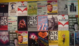
I heart/I hate

 I hate when police cars think they can not follow the law when its unnecessary to. For example them making a right turn not even having their signal on. Turning on their alarm just to get through traffic so its convient for them. I've seen so man police cars do this almost causing many accidents, I don't believe they have a right to do whatever they want just because their cops.